A Fun 404 Page — Why It Matters!
Wed, April 2, 2025 - 1 min read
A Fun 404 Page — Why It Matters
Error 404 isn’t the end. It’s an opportunity. An opportunity to engage, retain, and showcase your brand or product.
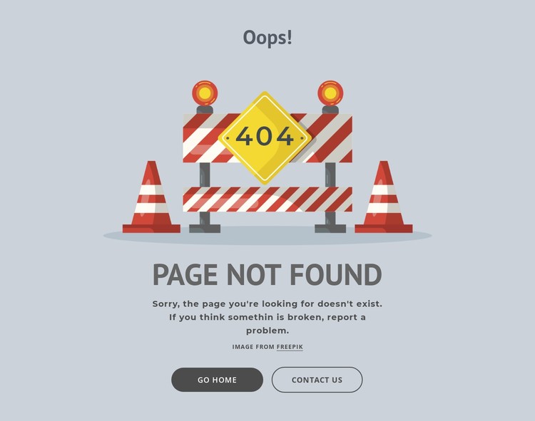
😐 Typical 404: “Page Not Found”
And that’s it. Blank. A dead end. The user doesn’t know what to do next. Often — they just close the tab. You lose them.
🤩 Custom 404: A Touchpoint and a Mini Brand Moment
Now imagine this:
- a fun illustration,
- a short, witty message,
- a “Go Home” button or “Try Search”,
- maybe even a mini-game or an Easter egg.
You’re not just keeping the user — you:
- show that you care about their experience,
- reinforce your brand tone and voice,
- increase engagement and loyalty,
- and reduce bounce rate.
💡 What to Add to Your 404 Page?
- Search bar — let them find what they’re looking for.
- Popular pages or blog posts.
- CTA — a button for demo, signup, or main feature.
- Discounts or special offers.
- Best-selling products or key services on your site.
- A touch of humor or charming visuals.
- A “lost? Here’s a map” type of logic.
🎯 Why This Matters
Because every error is a chance. Even 404. The user is already here — don’t let them leave empty-handed.
✅ Takeaway
Bottom line: A 404 page isn’t a failure — it’s a chance to connect. The more unique and helpful it is, the more likely users are to stay and explore your site. 🚀
Which idea do you like the most? You can even combine a few! 😉