Final stage of employment! You have successfully passed all previous interviews and technical screenings. This is the last task before official onboarding to our company.

Great job! My name is Alexander, I'm the team lead of the team you'll be joining. We were impressed with your knowledge and experience in the previous stages. This final practical task is a formality that will allow us to complete the hiring process. It demonstrates a typical task you'll encounter in our team. After successful completion, we'll immediately proceed with paperwork and introduce you to the team!
Technical Task
To successfully complete the employment process, you need to:
- Implement a
Buttoncomponent that accepts avariantprop and changes the button style based on its value. - Support the following button variants:
primary,secondary,success,danger,warning. - Apply the appropriate CSS class to the button depending on the value of the
variantprop. - Ensure the button displays the text passed through
children. - The code should follow modern React standards and be clean and readable.
Completion time: 10 minutes
Solution Example
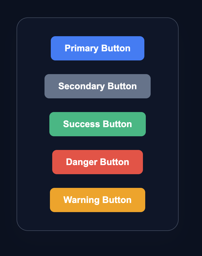
The final result should look something like this:
💡 Hint
- To apply multiple classes in React, you can use template strings or string concatenation.
- The base class
buttonshould be applied to all buttons, and the modifierbutton--{variant}depends on the prop. - Example of class formation:
className={button button—${variant}}. - Don’t forget to add the
data-testid="button"attribute to pass the tests. - Documentation: react.dev/learn/passing-props-to-a-component
👀 Solution
import React from 'react';
import './styles.css';

export function Button({ children, variant }) {
  return (
    <button className={`button button--${variant}`} data-testid="button">
      {children}
    </button>
  );
}

export default function App() {
  return (
    <main className="button-container">
      <div className="button-showcase">
        <Button variant="primary">Primary Button</Button>
        <Button variant="secondary">Secondary Button</Button>
        <Button variant="success">Success Button</Button>
        <Button variant="danger">Danger Button</Button>
        <Button variant="warning">Warning Button</Button>
      </div>
    </main>
  );
}Why this works: The Button component accepts two props: children (button content) and variant (style variant). Inside the component, we use a template string to form a class that consists of the base class button and the modifier button--${variant}. This allows us to apply different styles to the button depending on the value of the variant prop. The App component demonstrates the use of the Button component with different style variants.
🔥 Interview Case #2: Production Button
Final stage of employment! You have successfully passed all previous interviews and technical screenings. This is the last task before official onboarding to our company.
Great job! My name is Alexander, I'm the team lead of the team you'll be joining. We were impressed with your knowledge and experience in the previous stages. This final practical task is a formality that will allow us to complete the hiring process. It demonstrates a typical task you'll encounter in our team. After successful completion, we'll immediately proceed with paperwork and introduce you to the team!
Technical Task
To successfully complete the employment process, you need to:
- Implement a
Buttoncomponent that accepts avariantprop and changes the button style based on its value. - Support the following button variants:
primary,secondary,success,danger,warning. - Apply the appropriate CSS class to the button depending on the value of the
variantprop. - Ensure the button displays the text passed through
children. - The code should follow modern React standards and be clean and readable.
Completion time: 10 minutes
Solution Example
The final result should look something like this:
💡 Hint
- To apply multiple classes in React, you can use template strings or string concatenation.
- The base class
buttonshould be applied to all buttons, and the modifierbutton--{variant}depends on the prop. - Example of class formation:
className={button button—${variant}}. - Don’t forget to add the
data-testid="button"attribute to pass the tests. - Documentation: react.dev/learn/passing-props-to-a-component
👀 Solution
import React from 'react';
import './styles.css';

export function Button({ children, variant }) {
  return (
    <button className={`button button--${variant}`} data-testid="button">
      {children}
    </button>
  );
}

export default function App() {
  return (
    <main className="button-container">
      <div className="button-showcase">
        <Button variant="primary">Primary Button</Button>
        <Button variant="secondary">Secondary Button</Button>
        <Button variant="success">Success Button</Button>
        <Button variant="danger">Danger Button</Button>
        <Button variant="warning">Warning Button</Button>
      </div>
    </main>
  );
}
Why this works: The Button component accepts two props: children (button content) and variant (style variant). Inside the component, we use a template string to form a class that consists of the base class button and the modifier button--${variant}. This allows us to apply different styles to the button depending on the value of the variant prop. The App component demonstrates the use of the Button component with different style variants.
🧑💻 It's not a bug! It's a feature!
The code editor is intentionally hidden on mobile.
Believe me, it's for the best: I am protecting you from the temptation to code in less-than-ideal conditions. A small screen and a virtual keyboard are not the best tools for a programmer.
📖 Now: Study the task, think through the solution. Act like a strategist.
💻 Later: Sit down at your computer, open the site, and implement all your ideas comfortably. Act like a code-jedi!